How might we facilitate a music student's conducting practice?
Timeline: Feb 2019 - Aug 2019
Platform: Oculus Rift Touch
My Role: Design Lead
Tools: Unity, Illustrator, Procreate
Platform: Oculus Rift Touch
My Role: Design Lead
Tools: Unity, Illustrator, Procreate
Context
The UBC School of Music enlisted UBC Emerging Media Labs to create a VR learning tool that mimics the orchestral conducting experience.
A key factor for a music student is “podium time.” It takes a lot of resources to assemble an orchestra and schedule extra rehearsal time for students to take the podium, an exercise that makes conducting less accessible than other disciplines within music.
This project solves this major problem by making orchestral conducting training readily available. Although this virtual experience will not replace the real-life rehearsal in front of a live orchestra, it will offer a closer-to-reality venue that can provide substantive introductory and progressive experiential learning.
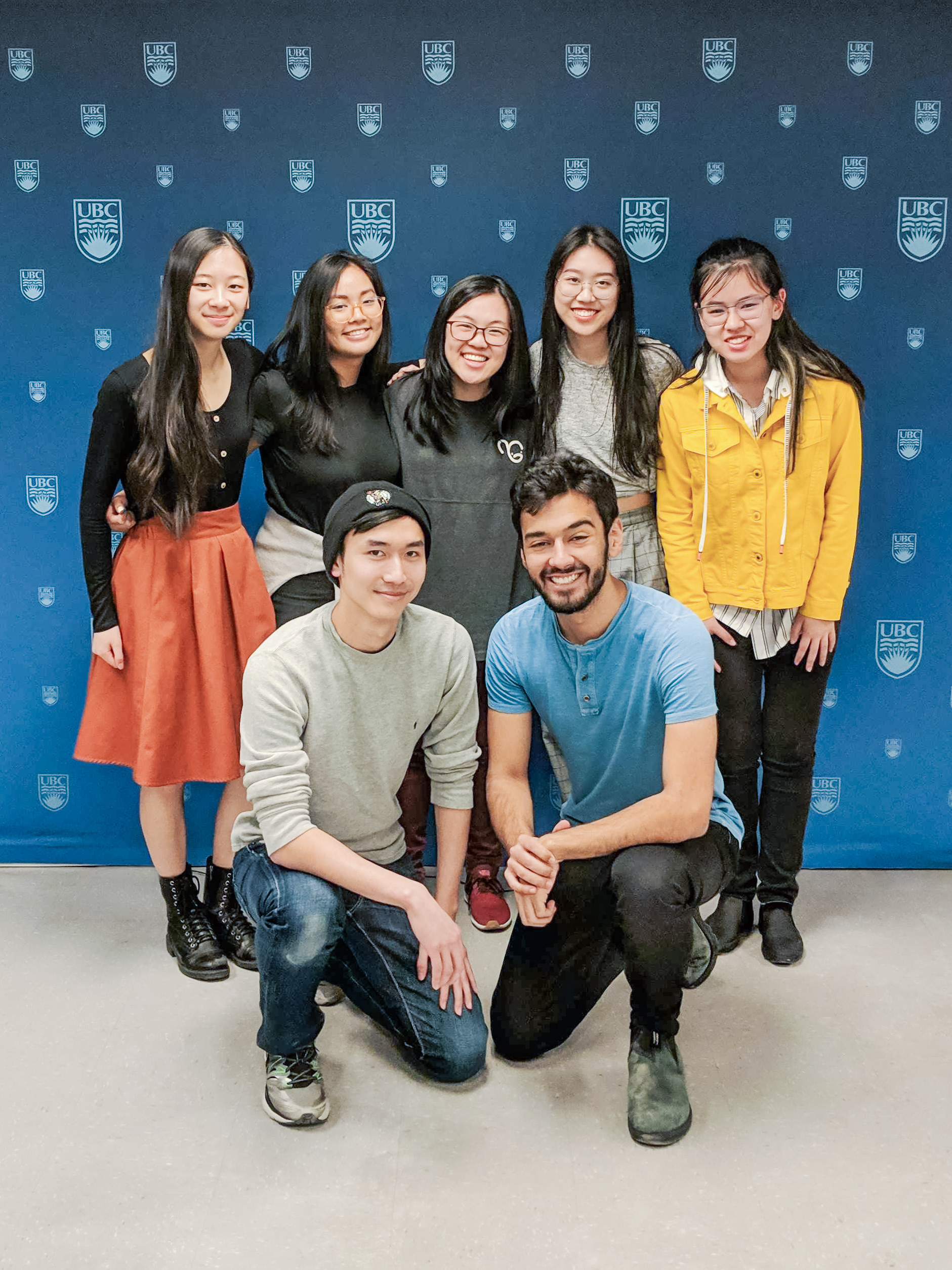
The core student team!
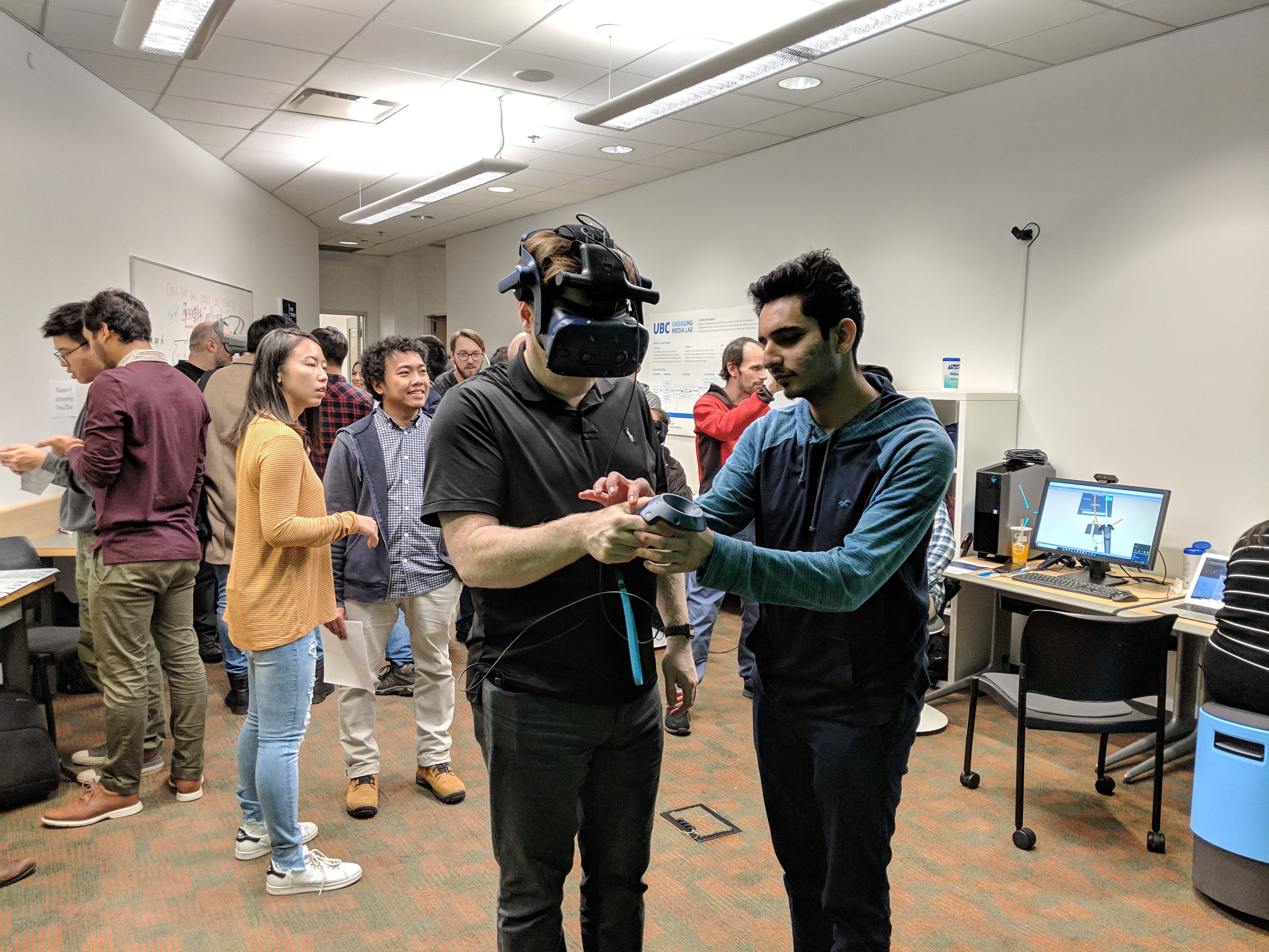
November Showcase with Key Instigator Dr. Girard (Centre)
Before I was brought onto the team, the bare skeleton of the game was in place. Below is a demo of its various features, as well as a clip of the most recent build in the EML August 2019 Showcase.
Aside from a much-needed visual face-lift, I identified a variety of pain points during my first play-through and compiled them together with insights gathered from 15 user testing sessions.
Research
In order to understand how to design a tool that would be most useful to conducting students, I first had to learn more about conducting itself. From the audience, conducting looks easy and almost magical - with one wave, you can command an entire fleet of instruments.
The reality of it is the complete opposite: 10 minutes of music takes a minimum of 8 hours of practice! Through two in-depth user interviews with music graduate students, I compiled the following insights on the essence of conducting.
Diegetic UI
As our target audience are new VR users, I found during testing that most became overwhelmed by all the different buttons available on the controller. My preconception about conducting was that the beat is maintained by the right hand, and the left hand simply flips pages. This is far from the case, as it is considered to be almost more important than the beat, as it is used for expression. One grad student emphasized "maintaining the sanctity of the left hand," and thus I made the decision to keep it hands free.
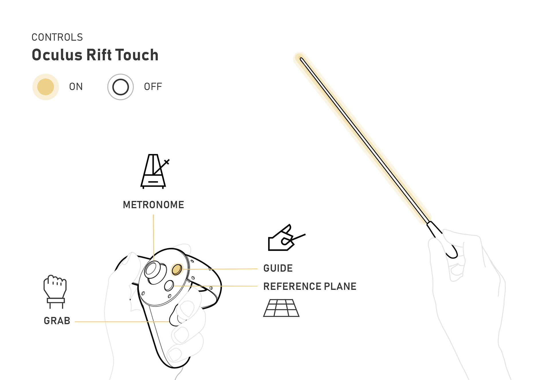
Exploration of possible controls if they were placed on the Oculus controller.
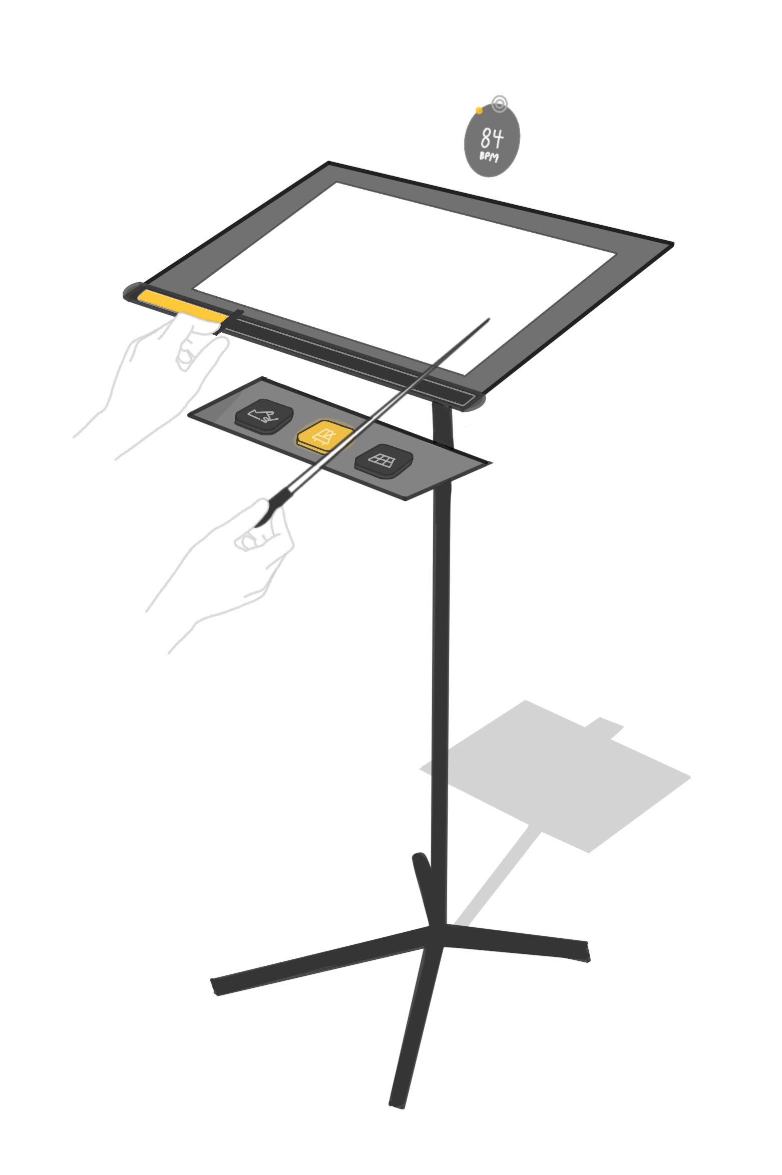
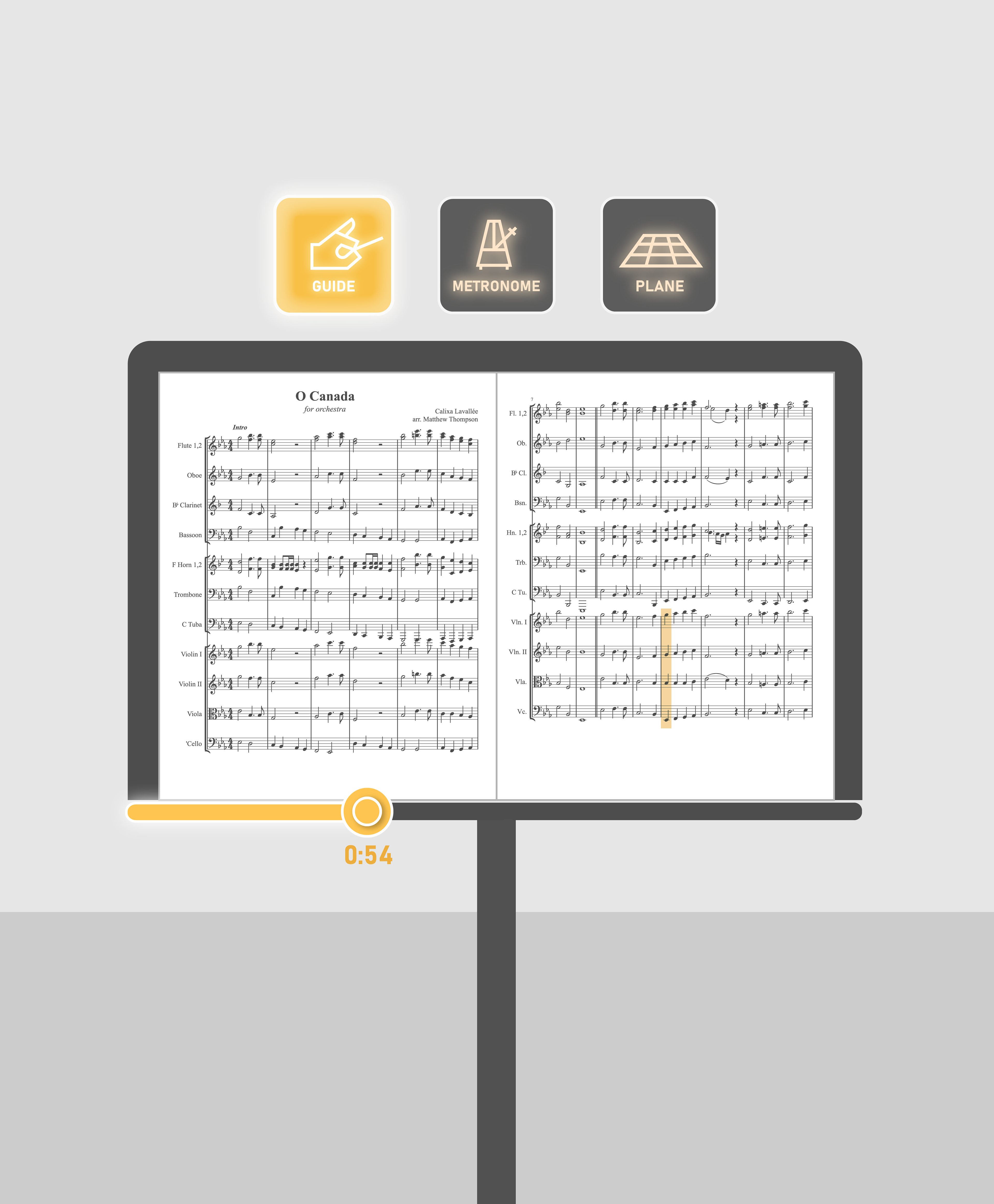
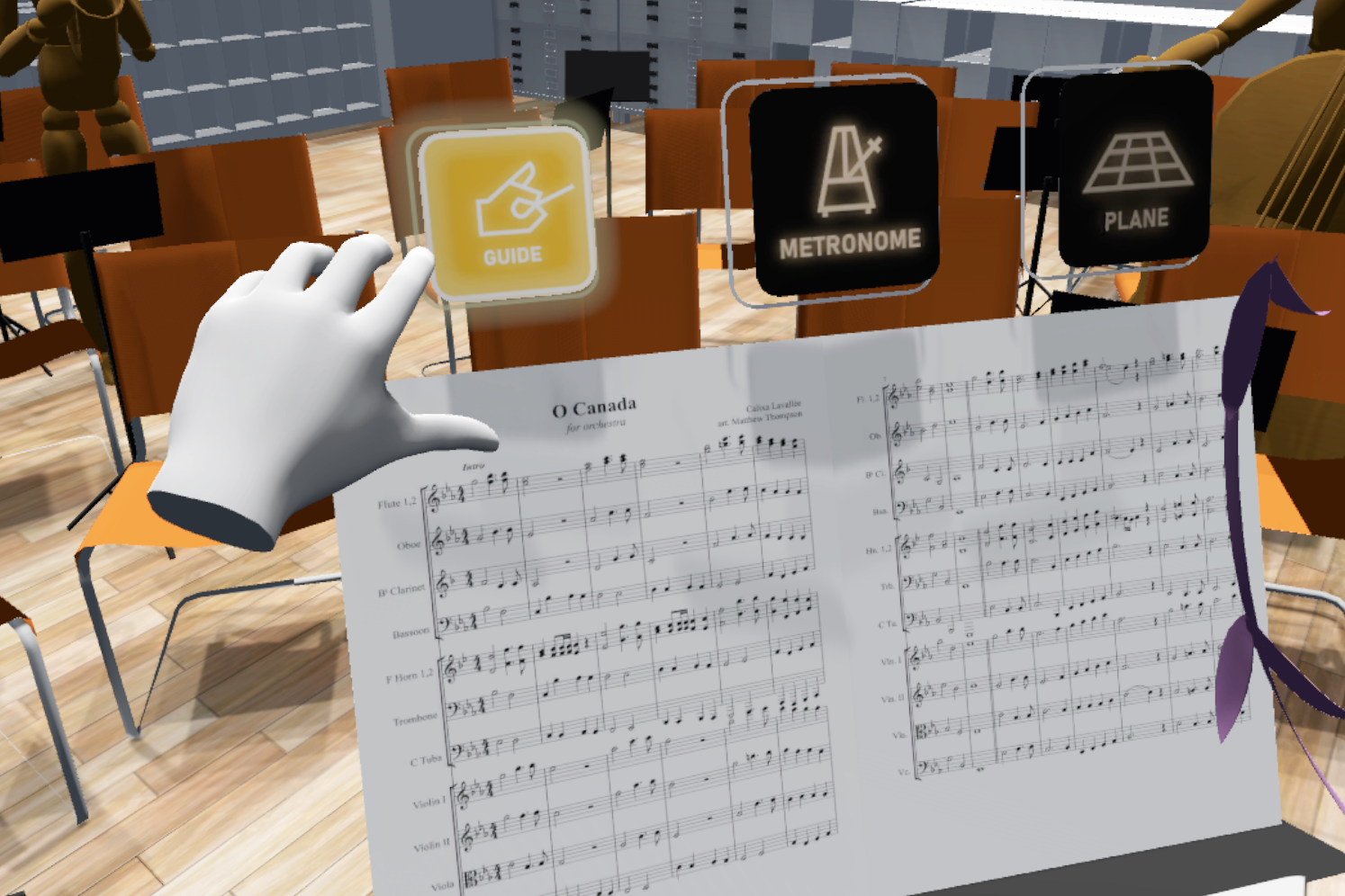
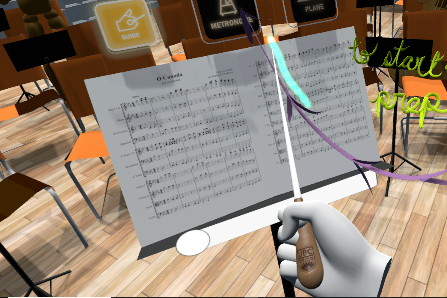
UI placement on music stand.
Illustrating the placement of buttons.
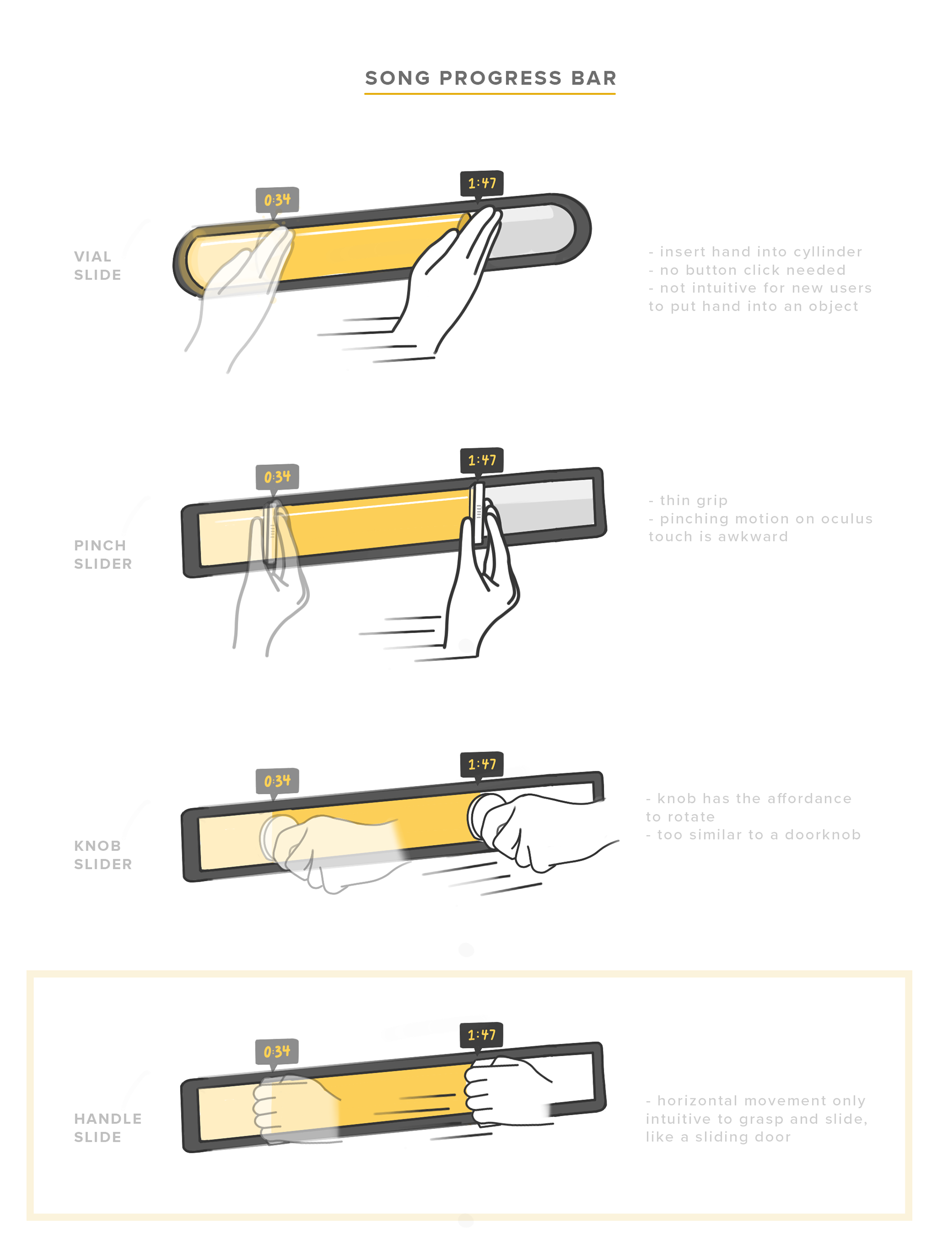
Song progress bar iterations.
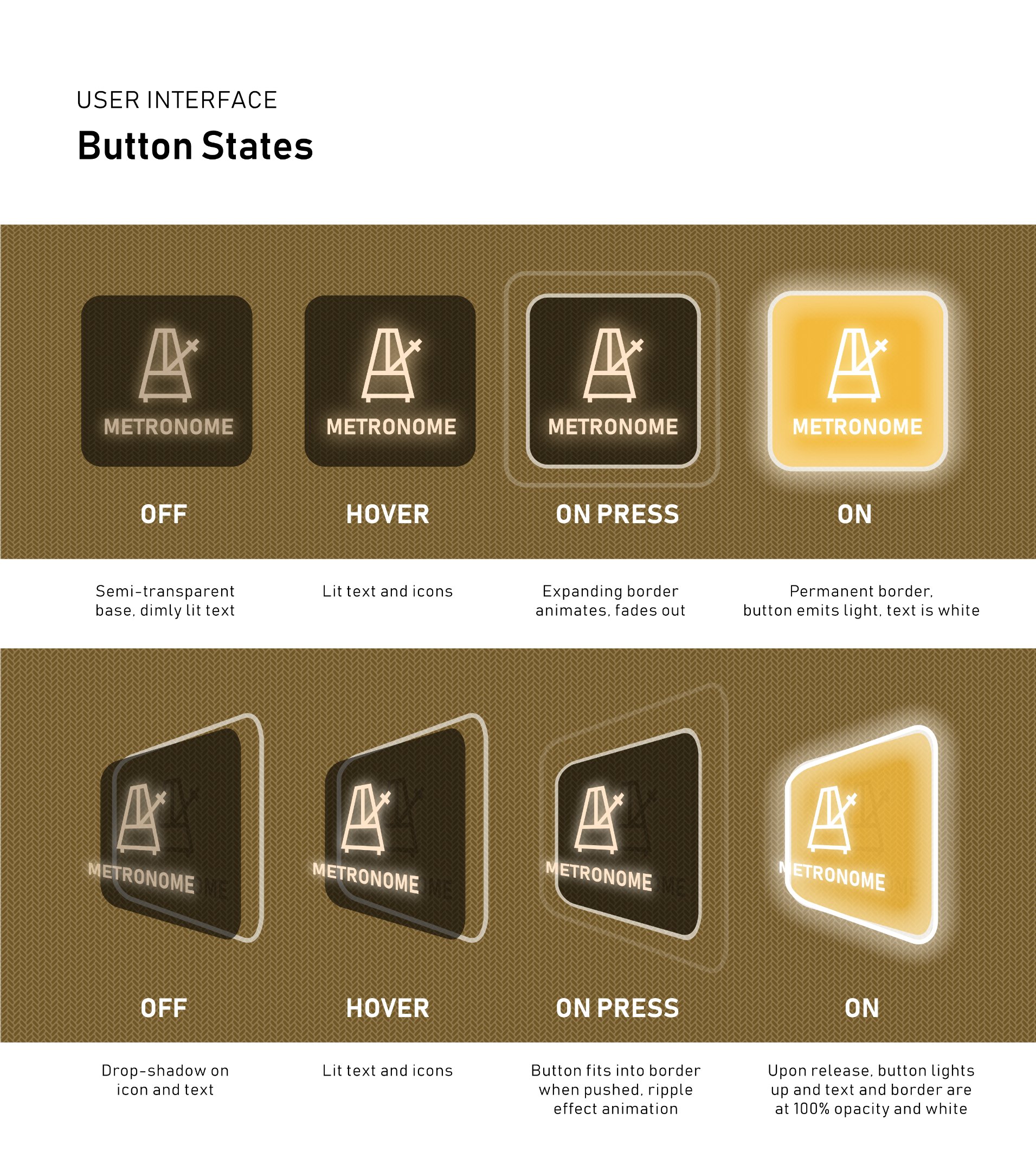
Detailed explanation on button mechanics.
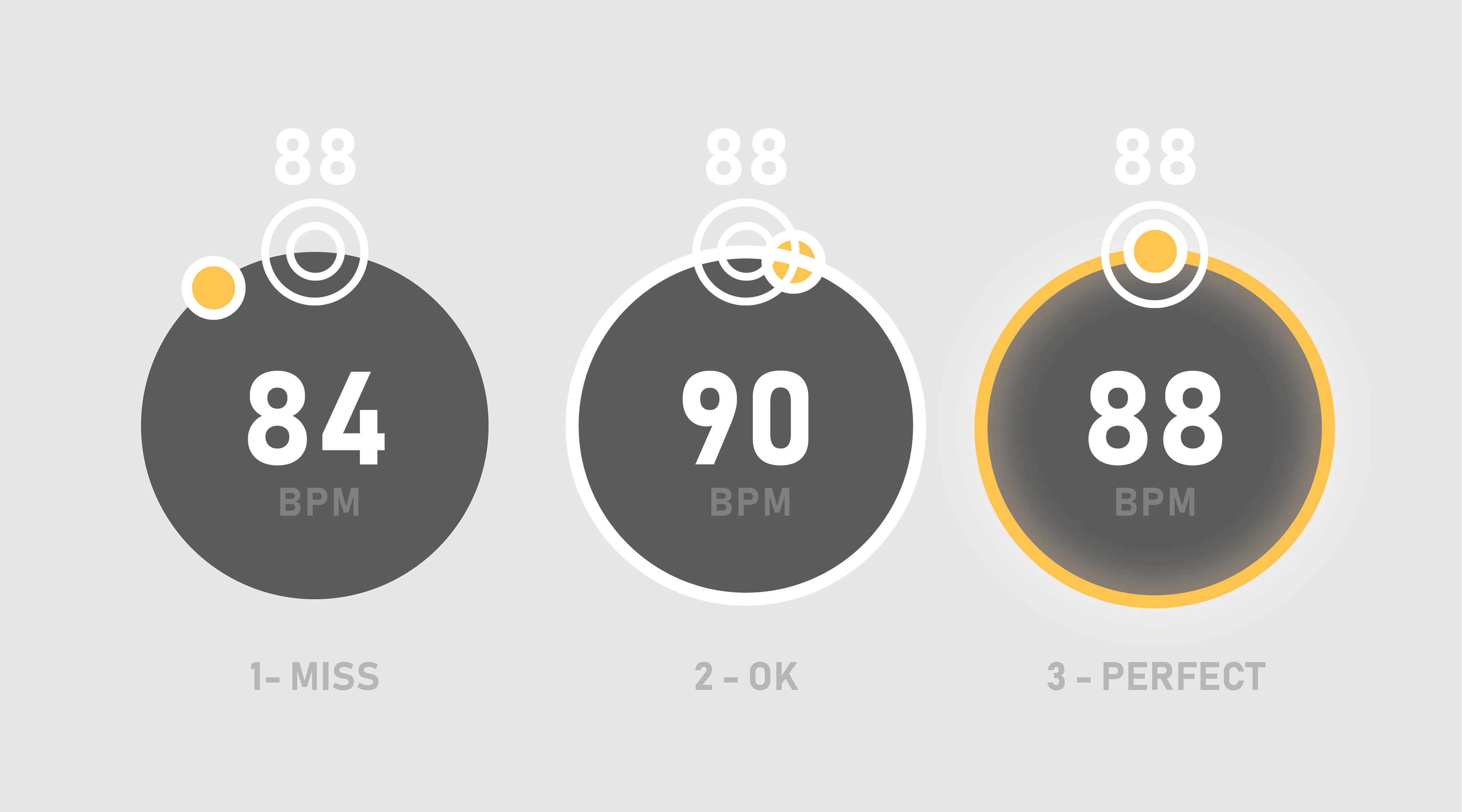
BPM indicator for the user to know what speed to aim for.
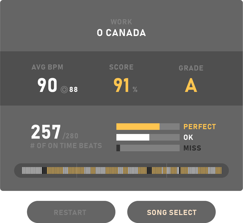
Report card screen highlighting areas of improvement.
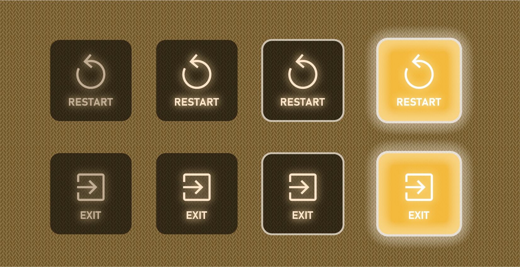
Button states for restarting the game or exiting.
Beginner vs Power Users
The time it takes to press a button on a controller versus reaching out and pressing one is significantly shorter, which would lend itself to power users looking to quickly toggle options on and off. However, because the experience is catered to the inexperienced user, diegetic UI was instantly more understandable to them - no more questions were asked about what button does what during user testing.
The time it takes to press a button on a controller versus reaching out and pressing one is significantly shorter, which would lend itself to power users looking to quickly toggle options on and off. However, because the experience is catered to the inexperienced user, diegetic UI was instantly more understandable to them - no more questions were asked about what button does what during user testing.
Realism
Our goal was to have the experience be as close to the real thing as possible. Therefore, if the user only sees their gloved hands holding a baton, emphasis is placed on the movement of the hands - not on the controllers.
Tutorial Sequence
It is important for the student's first experience in the game to be intuitive - this is accomplished through a ramping structure, in which one starts with the most basic motion interactions (walking, grabbing objects) and works their way up to more complicated interactions (choosing menu options, conducting). The Chan Centre 3D captured environment - a highlight of the project - is revealed with much fanfare at the end of the tutorial.
1 - Everything is dark, except for a music stand directly in front of you. A spotlight hits it from above, and on it is a baton. On the stage floor are footprints heading towards the music stand.
2 - Walking forward, you hear the reverb of your footsteps echo throughout the large room. Stepping into the spotlight, the stand comes to life, showing you how to pick up objects.
3 - Picking up the glowing baton, the lights fade in to reveal an orchestra in front of you while you hear the swelling sound of the orchestra tuning.
4 - “Welcome to… the Interactive Orchestra!” Sparkling cursive letters - written with a flourish - appear on the stand. The music stand lights up and presents menu options.
Custom Baton
Instrumental to the conducting experience was the baton itself. Taking it upon myself to learn the basics of Blender, this was the first time I modeled something from scratch, without assistance from a tutorial. I learned the basics of UV and texture mapping. This evoked a reoccurring cry of delight for players who took a closer look at what they were holding - a valuable opportunity to reinforce the UBC brand.

Engraved wood effect using a normal map.
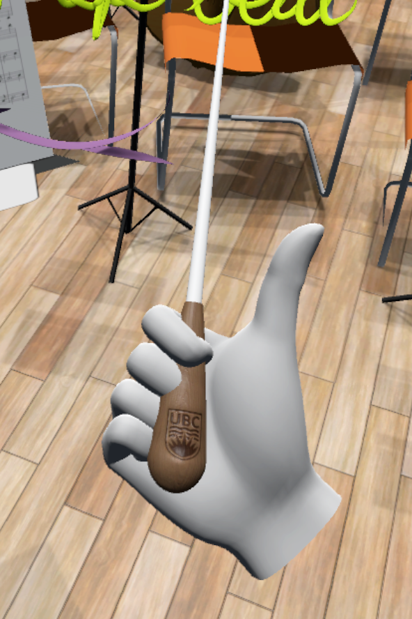
Thumbs up for UBC!
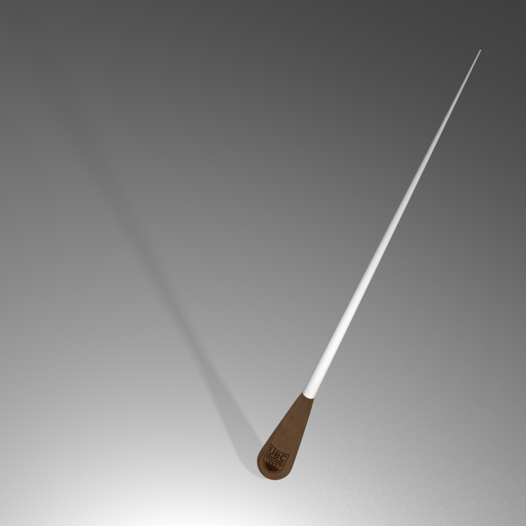
14in baton, as commonly used by instrumental conductors.
Future Milestones
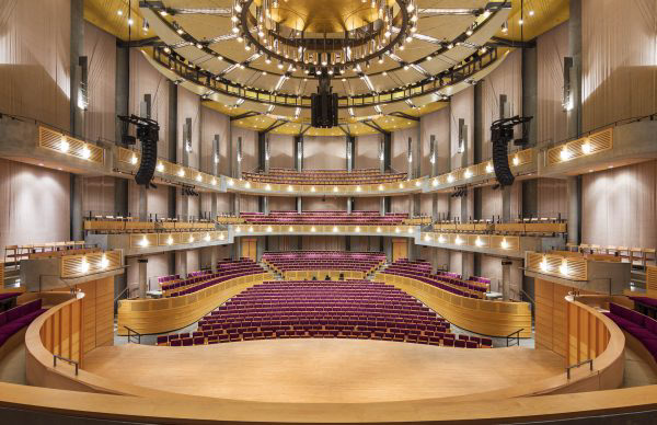
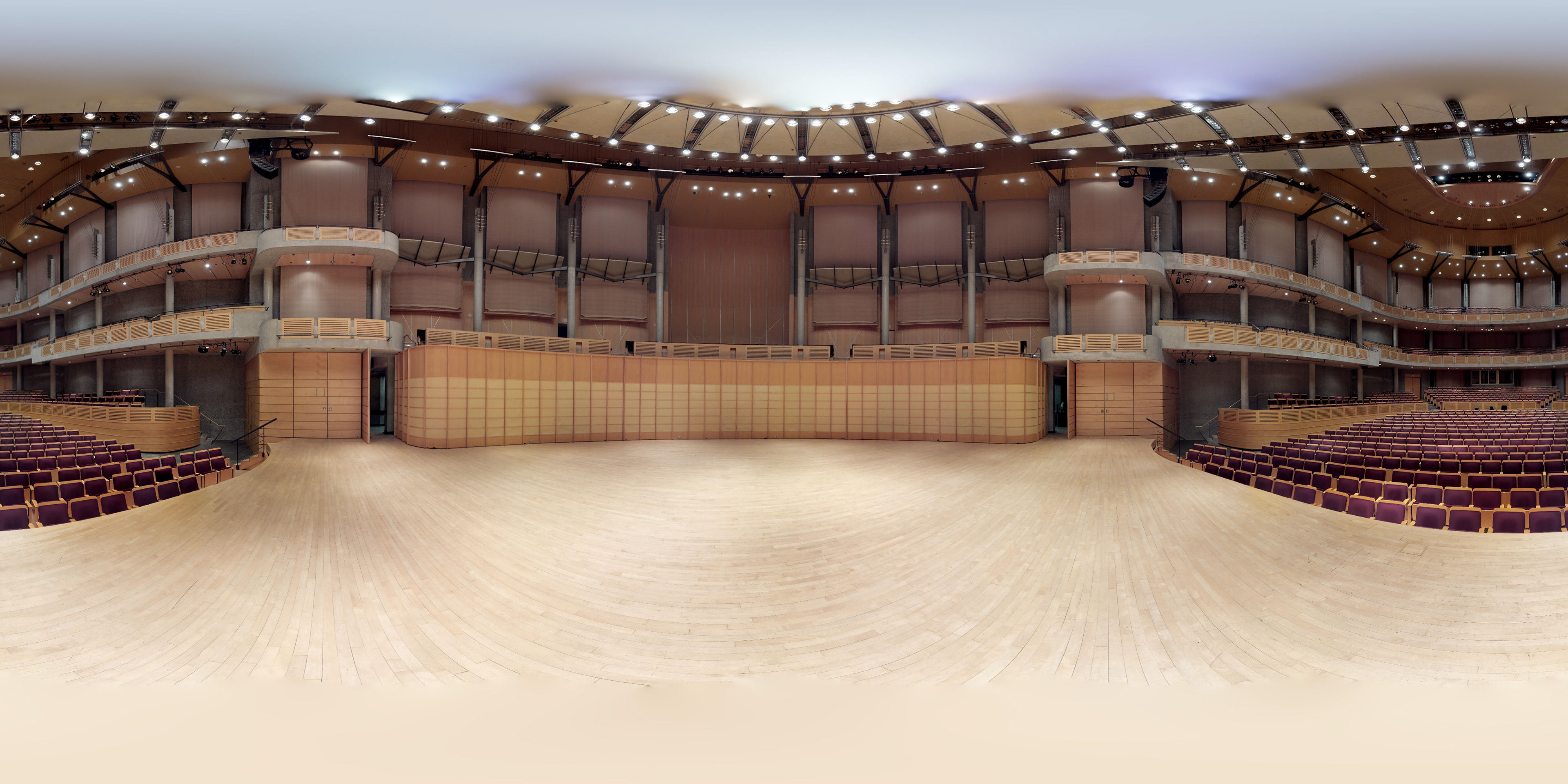
The final experience will be in a 3D captured model of the Chan Centre for the Performing Arts. Future implementations include displaying BPM, calculating a score for the player at the end of the song, a menu to choose different songs to play, and having the orchestra react to the conductor's movements.
