

"How might we maximize exploratory learning in VR?"
Timeline: Oct 2018 - Sept 2017
Project Type: Virtual Reality (HTC Vive)
Role: UX/UI Lead
Tools: Unity 3D, Illustrator, Photoshop
Skills: VR Prototyping, Scrum, Illustration, Concept Design
Project Type: Virtual Reality (HTC Vive)
Role: UX/UI Lead
Tools: Unity 3D, Illustrator, Photoshop
Skills: VR Prototyping, Scrum, Illustration, Concept Design
Context
This project was initiated by the UBC Emerging Media Lab and the UBC Geography Dept.'s partnership with a foreign university to produce a virtual reality showcase of Vancouver's crown jewel - Stanley Park.
The area is interesting for its Indigenous historical background as well as its biodiversity. The objective of this was to bring Stanley Park to the classrooms of students abroad to study an ecosystem different from theirs.
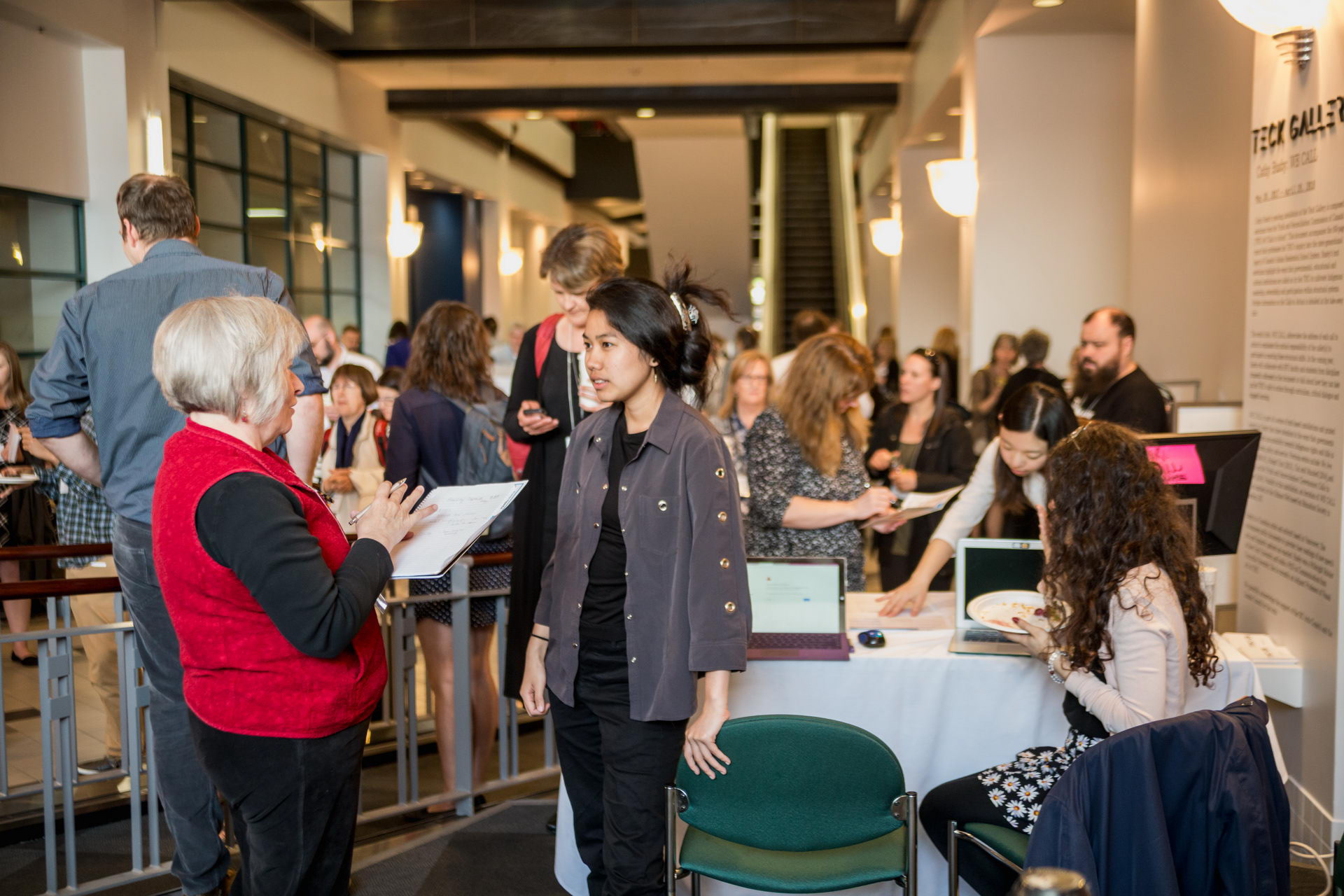
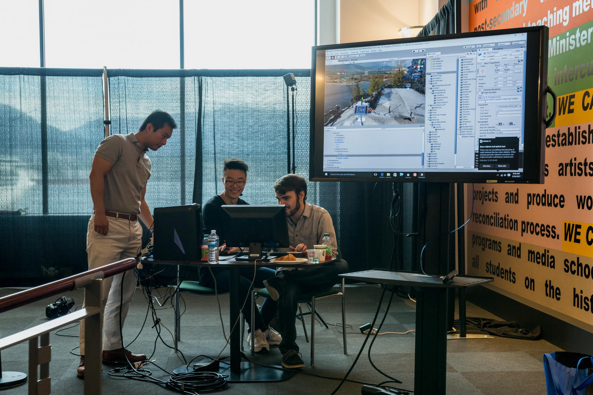
Consultants on the project are industry professionals Metanaut, who assist in the creation of the project using best practices. This project was showcased at the 2017 BC Open Textbook Summit, who have written an article on the details of the project.
As advocates of the open internet, detailed documentation of this project is open to the general public and can be accessed here.
Ideation
Navigating in virtual space is intimidating for many. As our users are students, it is often their first time trying VR. With this in mind, we prioritized making the experience as unobtrusive and natural as possible. The following are concept sketches exploring possible ways to navigate the space, providing the tools for the student to explore on their own without getting lost.
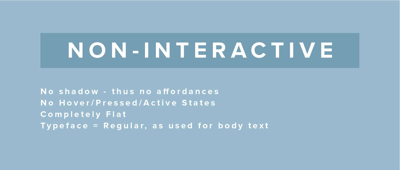
"How can I translate this desire to be unobtrusive into interactive elements?" My answer to this question was utilizing transparency. Transparency allows the focus of the experience - the park environment - to come through. Keeping the visual weight light and airy, many whites, light blues, and greens were used; which are reminiscent of Vancouver's city colours.
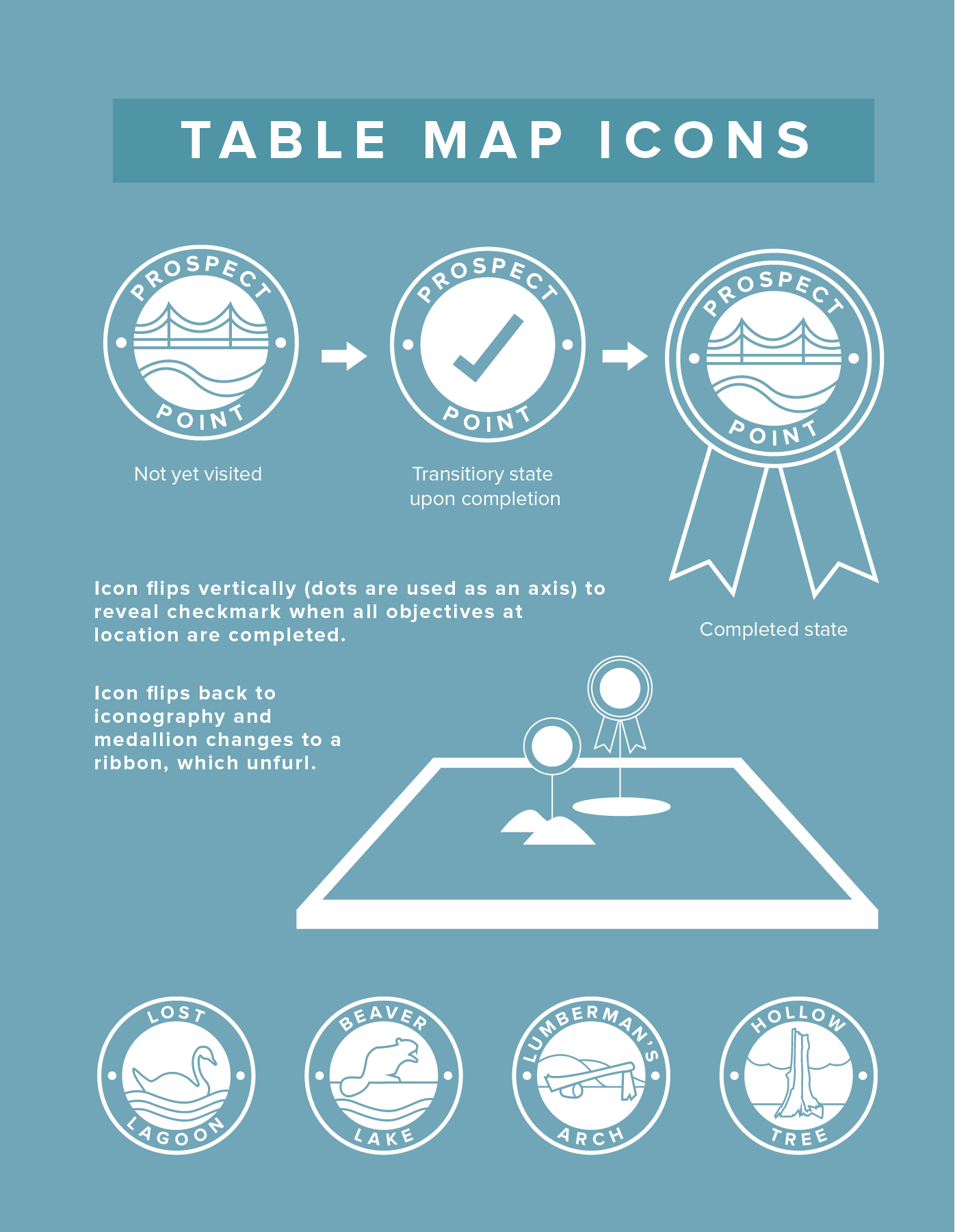
Banner highlighting the 5 focus areas - Prospect Point, Beaver Lake, the Lost Lagoon, Lumberman's Arch, and the Hollow Tree.
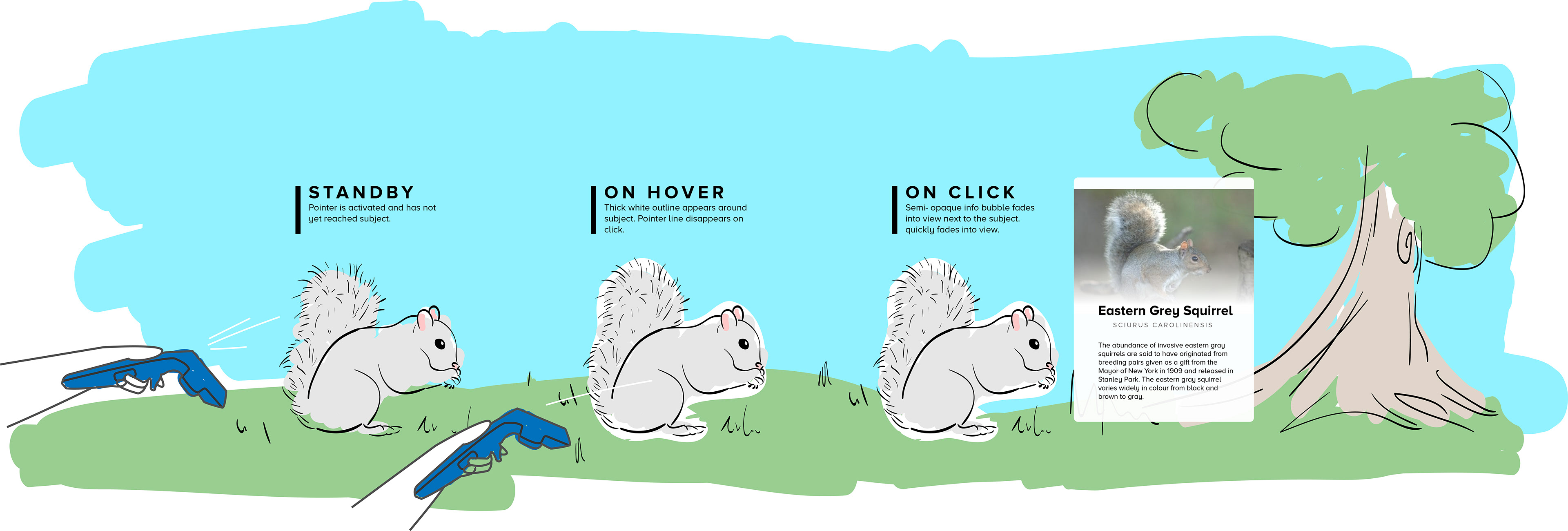
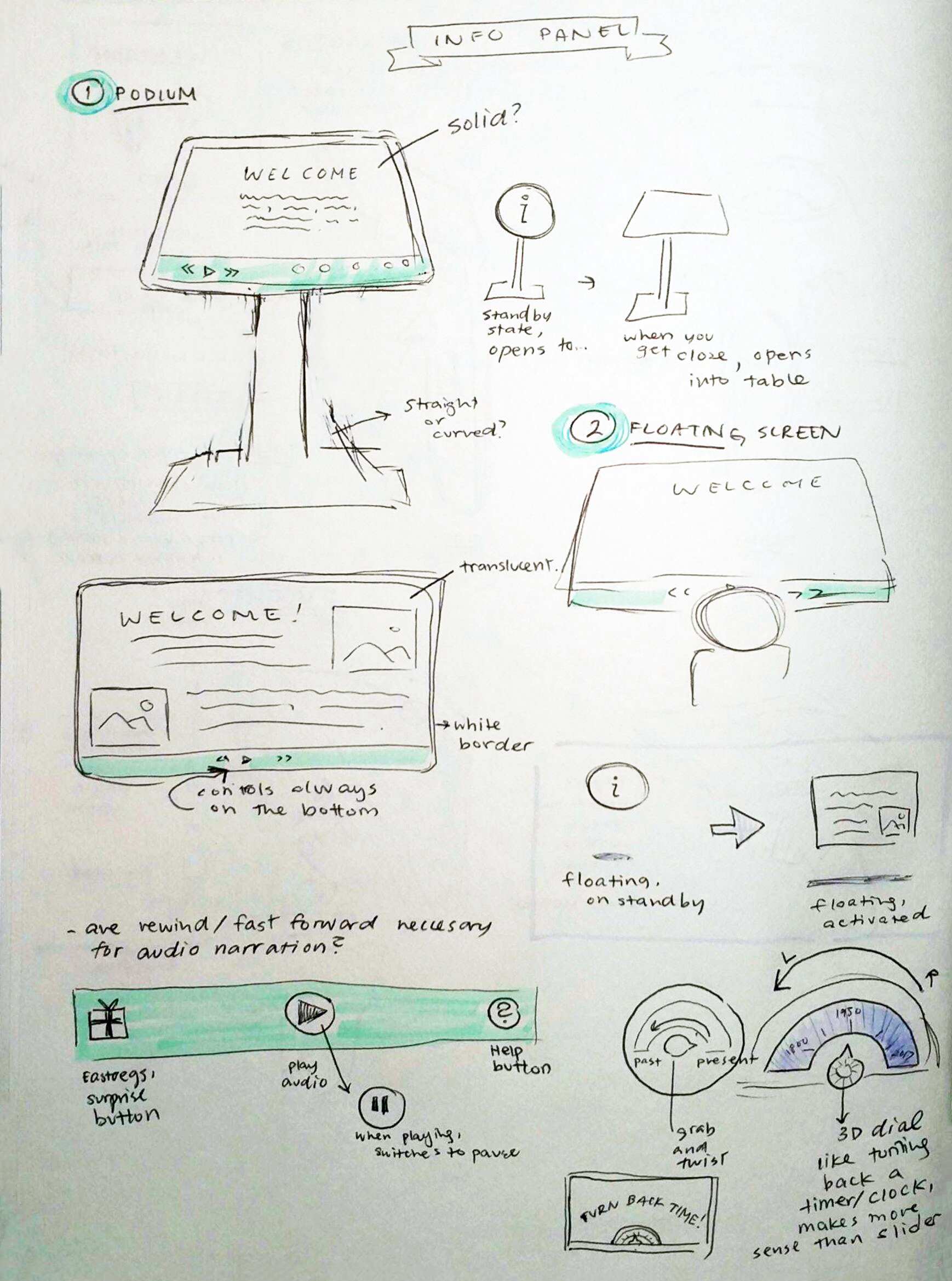
A sketch of the Geodex pointer, allowing curious users to learn more about their environment. A translucent info box appears with basic facts.
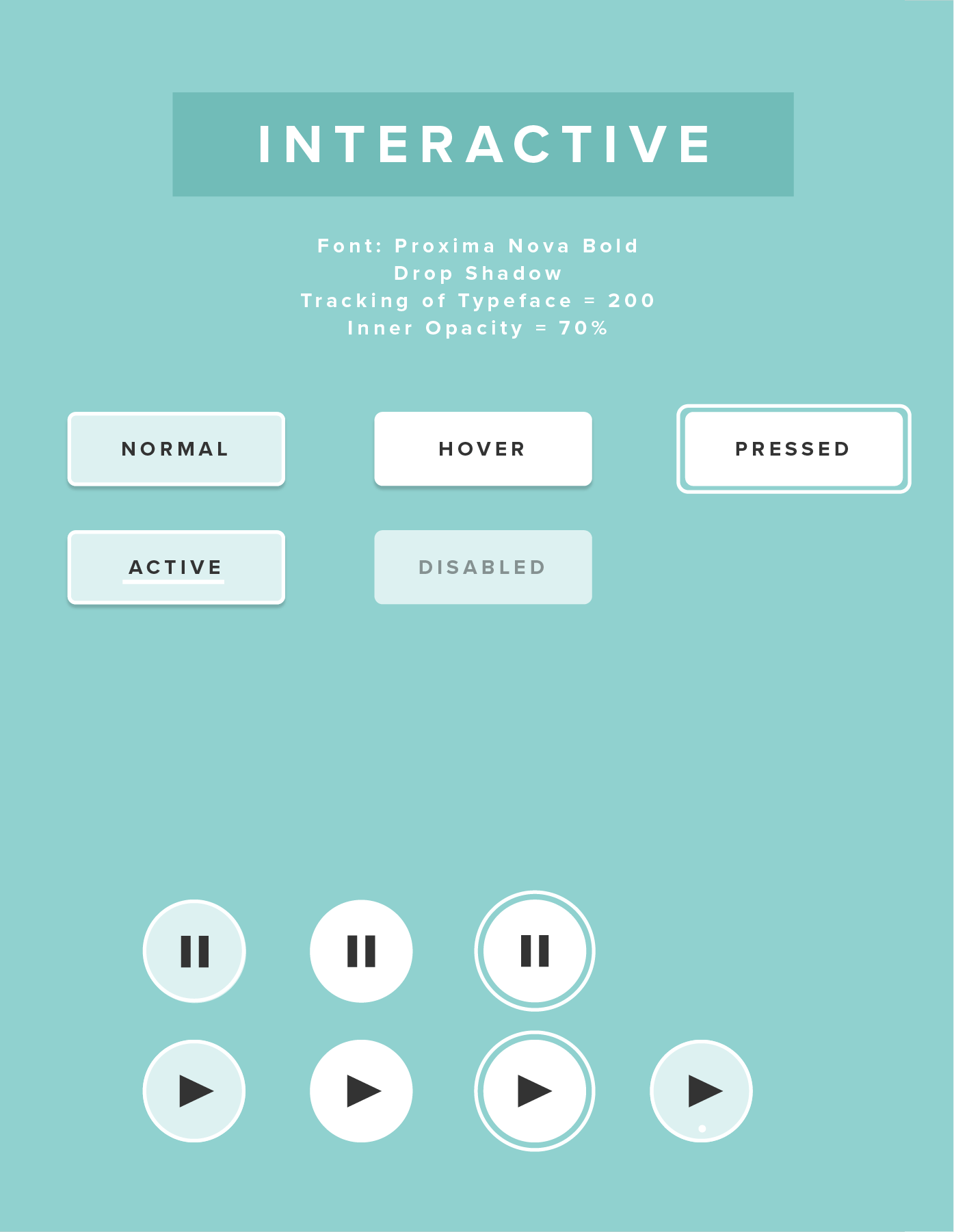
Conceptual button states for media playback and buttons.
However, in virtual reality, there is a dire need for visual feedback for every user interaction, as a correlation is made between the real world and VR. In the real world, everything has an equal and opposite reaction. On a screen, one might be able to get away with more static interactions, but those feel strange in 3D space. Turning to the internet, I conducted research on UX design for VR.
Research
Historical photos and information about Stanley Park needed to be displayed within the game world. The concept of the info panel allows the user to easily access these images through a familiar interface, such as those often seen at tourist sites.
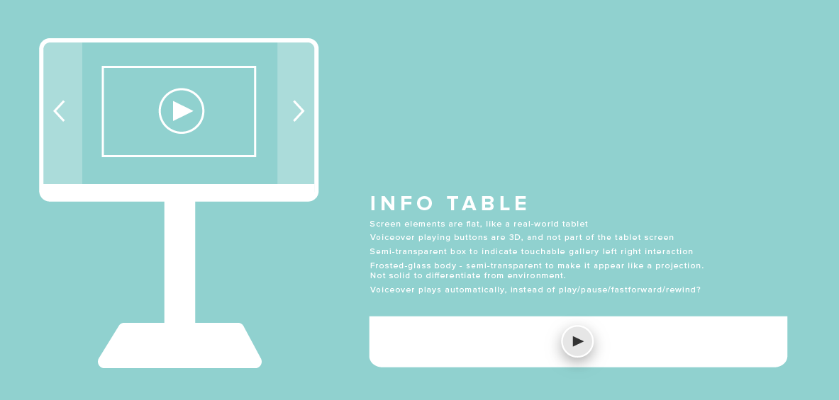
My initial idea for the info panel was for it to be like a flat screen, seen first as a halo on the ground that opens up upon approach. I enjoyed its compatibility with translucent elements, which is a theme that ran throughout the project.
In this instance, however, it contradicted my initial research. It is unnatural for someone's hand to go through an object that is seemingly solid, as explained in Mike Alger's VR Interface Design Manifesto. Buttons are hard things to understand if they do not physically move when the user interacts with them.
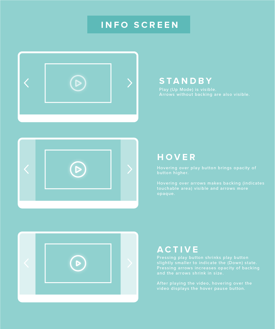
Initial brainstorming for info-panel button states. The transparency of the side panels became hard to see, as the content it was supposed to overlay only filled the center of the screen.
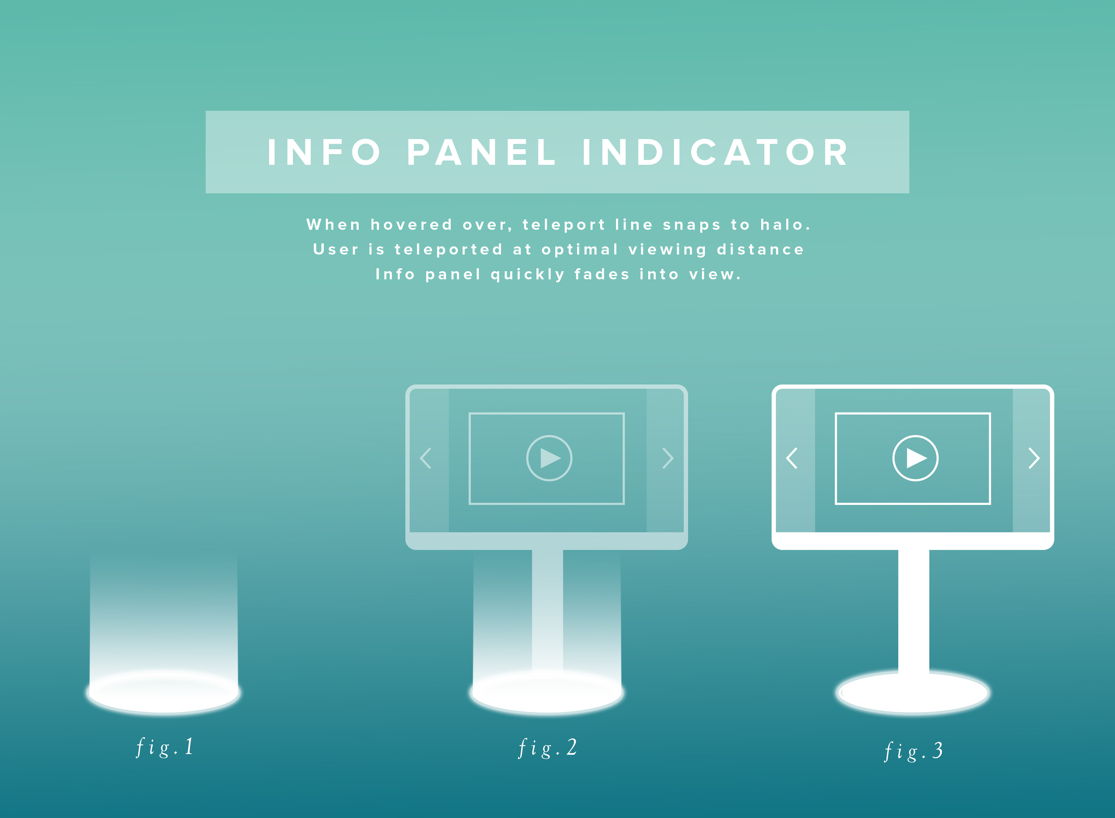
A sequence illustrating how the panel would appear into sight.
In its final release, the panel's overall look remained the same with its round, friendly edges (no one wants to touch a sharp, pointy thing). However, the left and right arrows worked as physical buttons that could be pushed on and would move with the controller. After toying with the idea of using the controller as a laser pointer, I settled on the simple physicality of a 3D button to cater to first time VR users.
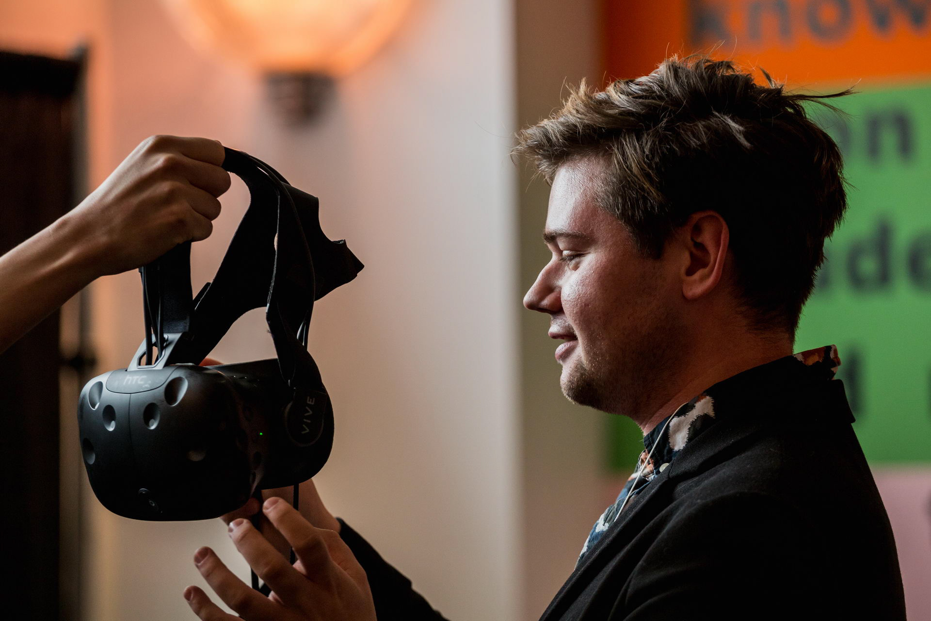
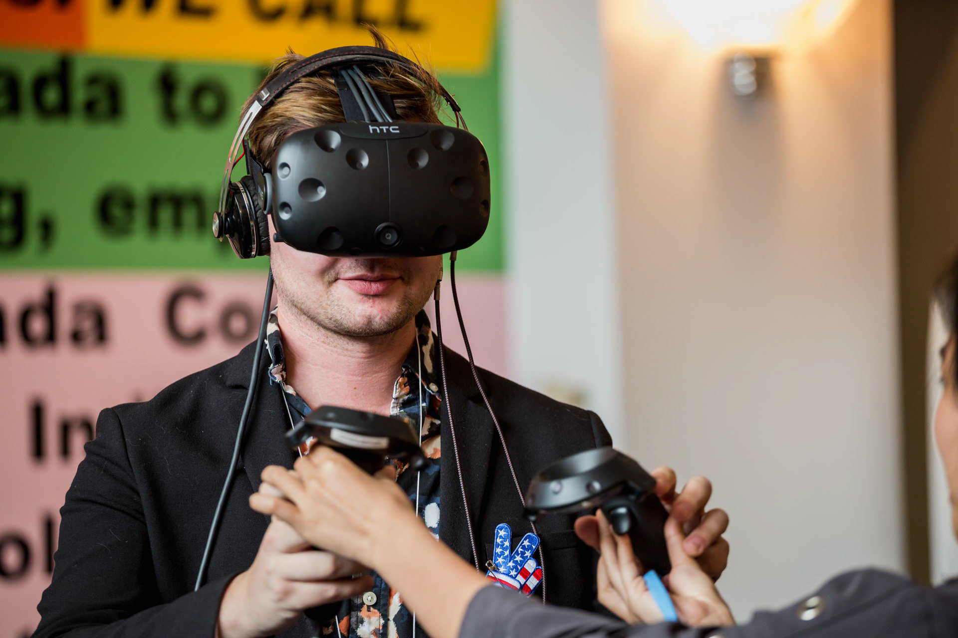
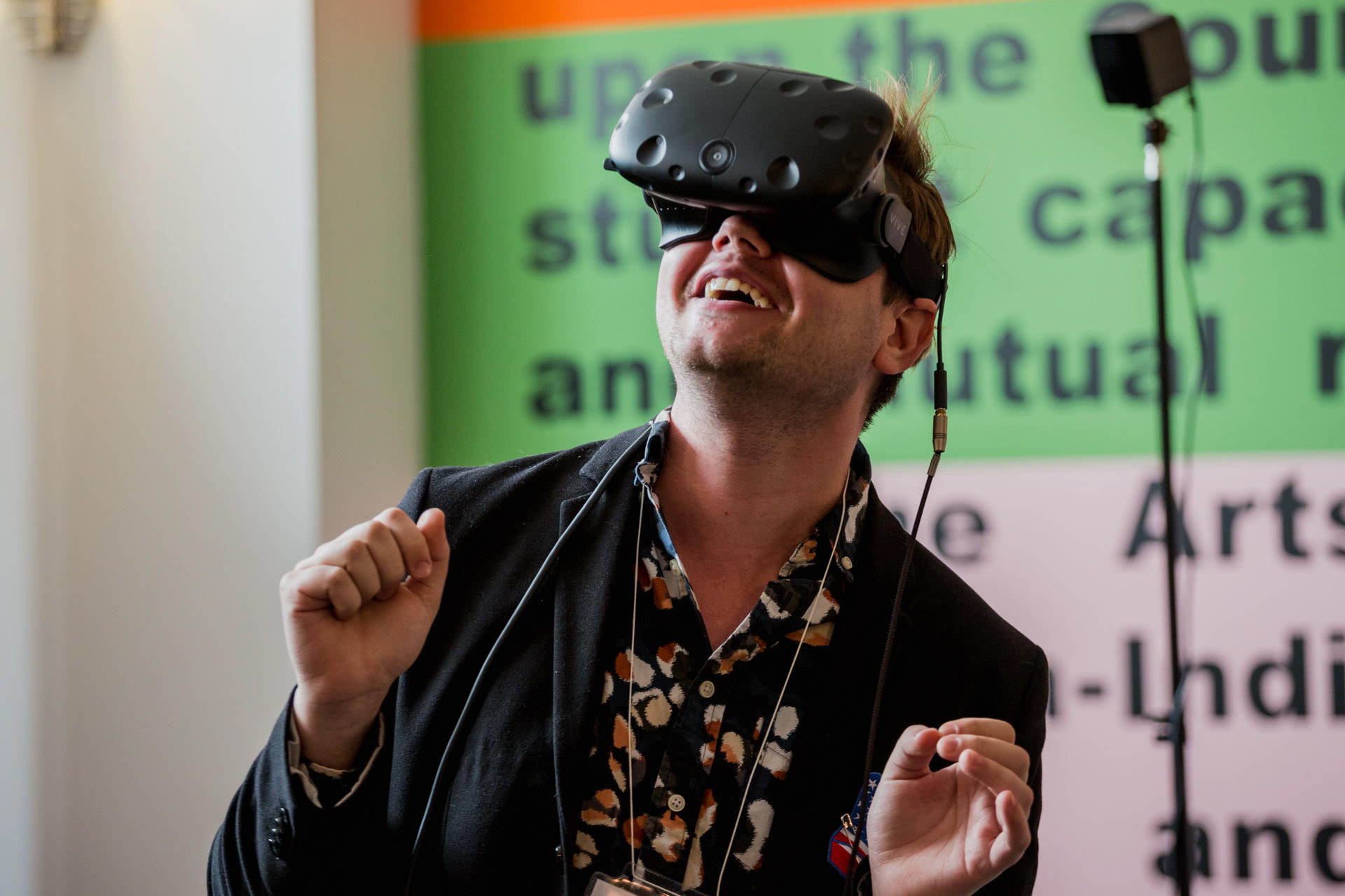
User Feedback
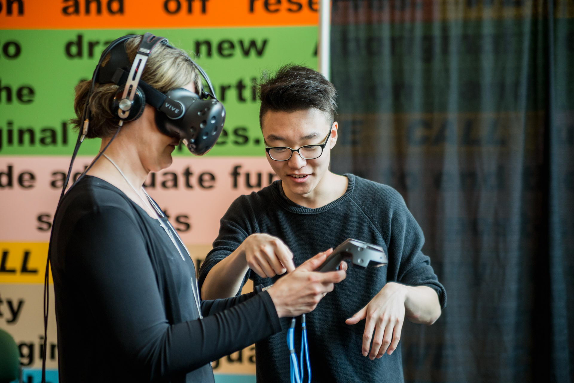
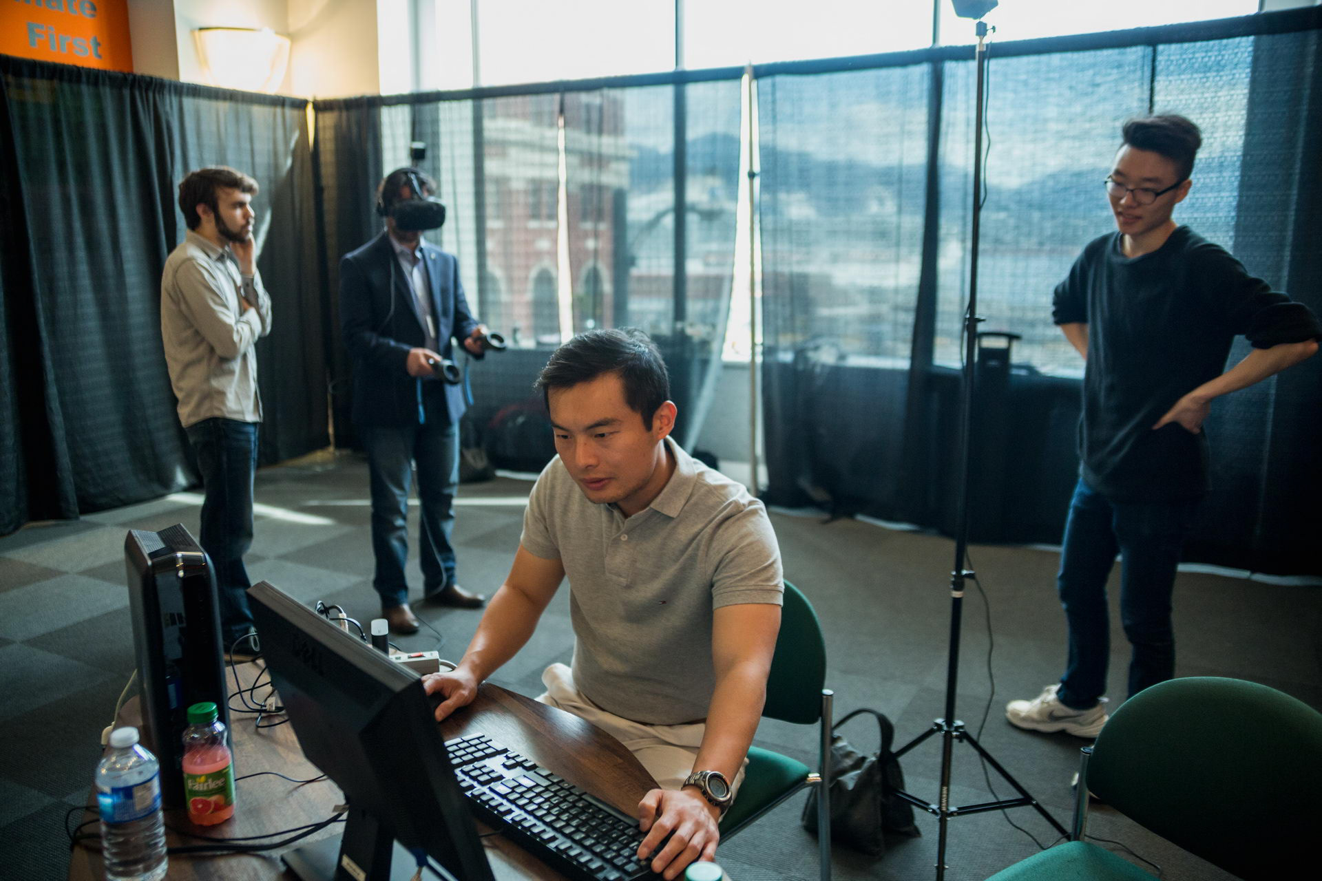
As the project was on the HTC Vive, it was difficult to accommodate for students not working on the project to come into the designated space. This limited the amount of user research that could be conducted. The majority of our insights were gathered at our presentation at the BC Open Textbook Summit. Running our mouths dry from explaining controls, we discovered a dire need for a tutorial sequence.
The tutorial room we created takes place in a hallway with posters hung up on the wall. A voice-over explains each function thoroughly while the user follows along. This assures that both aural and visual learners can process the information quickly and easily.
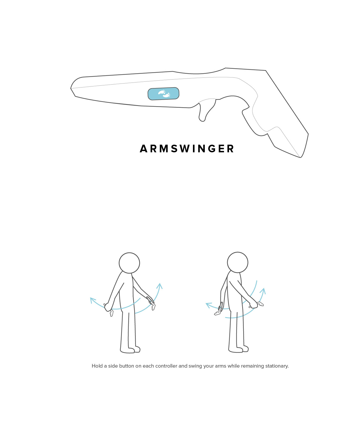
After the Open Textbook Summit, I noticed a variety of pain points that users came across. Many held both armswinger buttons while simultaneously physically walking through space. This disoriented them severely as the speed at which they can move became unnaturally high.
This was solved by allowing the user to hold one side button but still be able to use the armswinger function. The illustrations also helped greatly in communicating proper usage.
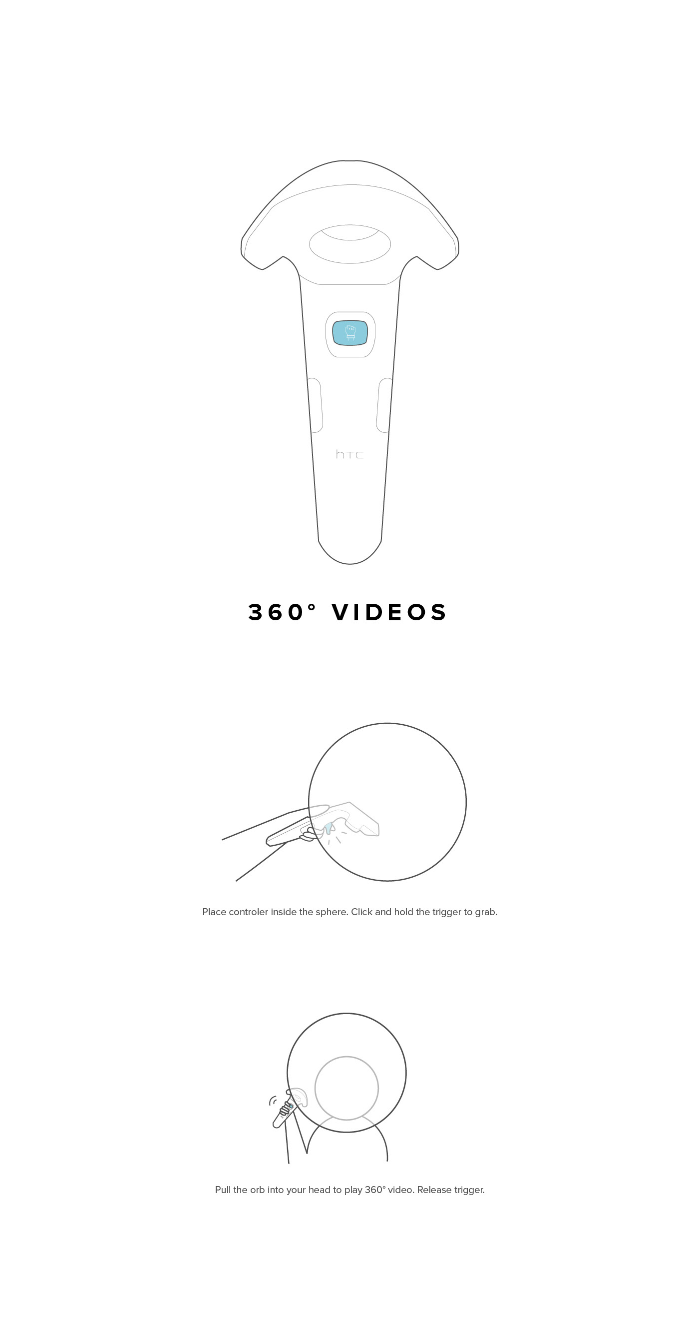
Another issue was that the floating photospheres went unnoticed. They were textured with a preview of the 360° image, but only when we placed them on a podium did people notice and interact with them.
Navigation
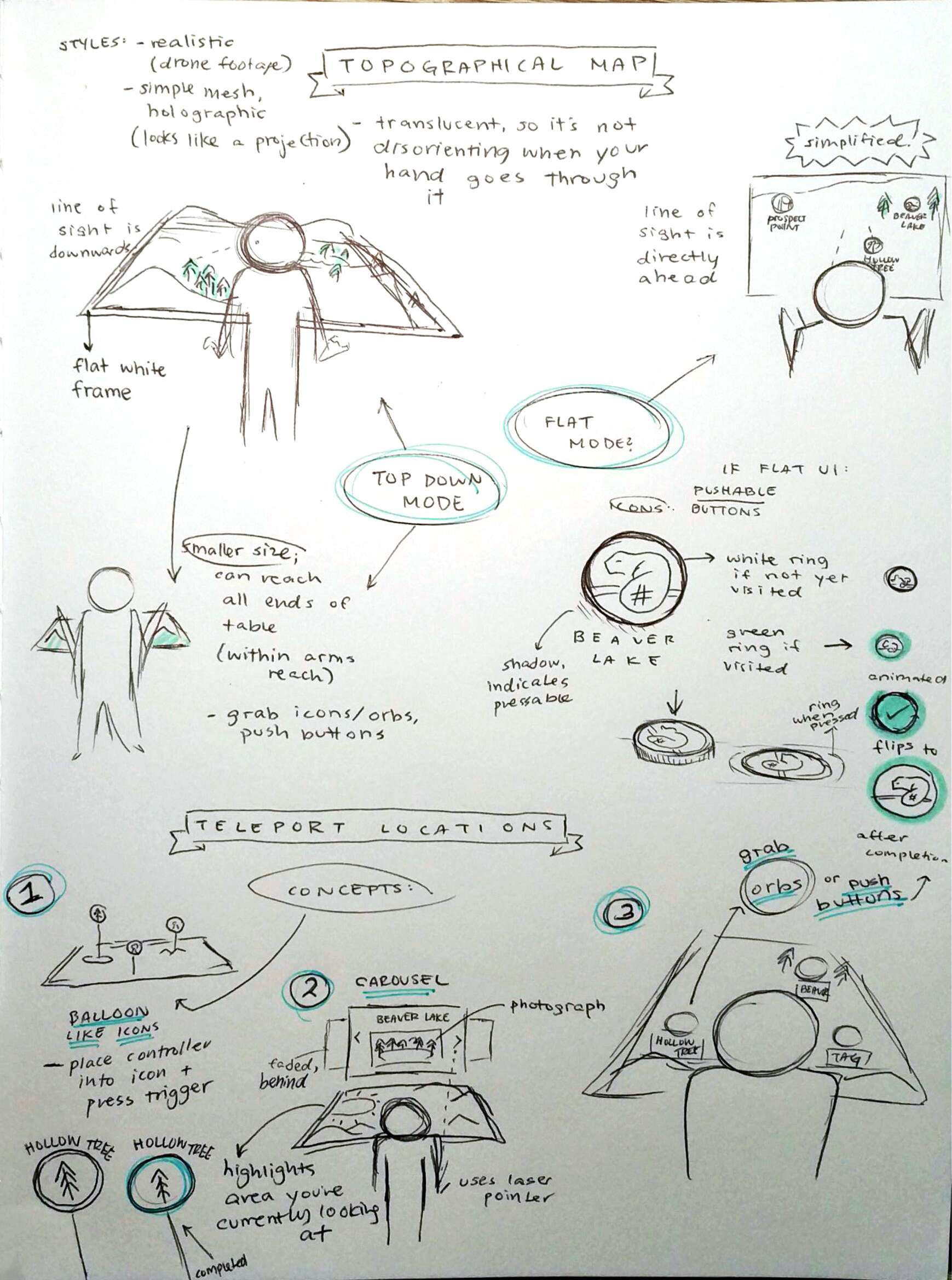
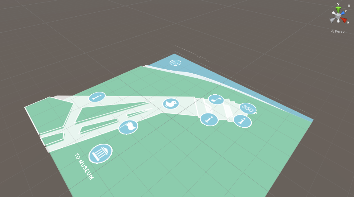
The minimap is a core part of the navigational interface for the user. Because a realistic model of the area would be excessively complicated to render and was visually heavy, the map was simplified. Rather than creating a 3D model, I overlaid translucent 2D layers onto individual quads in Unity.
A side view of the minimap, which shows the difference in height between sea level and the lookout point.
Icons were also placed on separate quads so that they could be easily moved around. Many iterations were made to make the map align with the designated teleportable area.
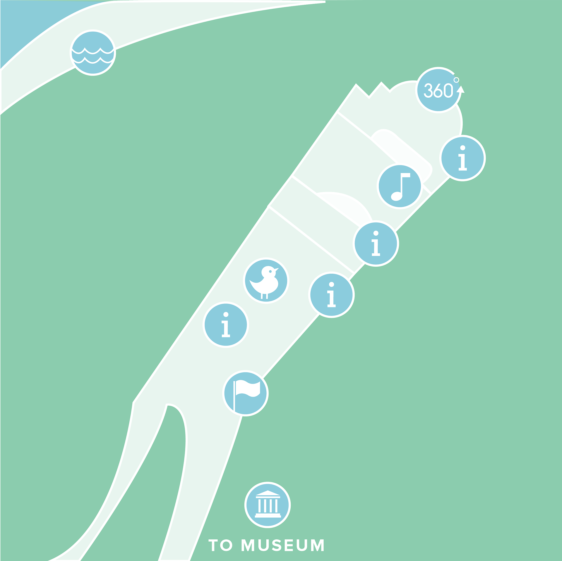
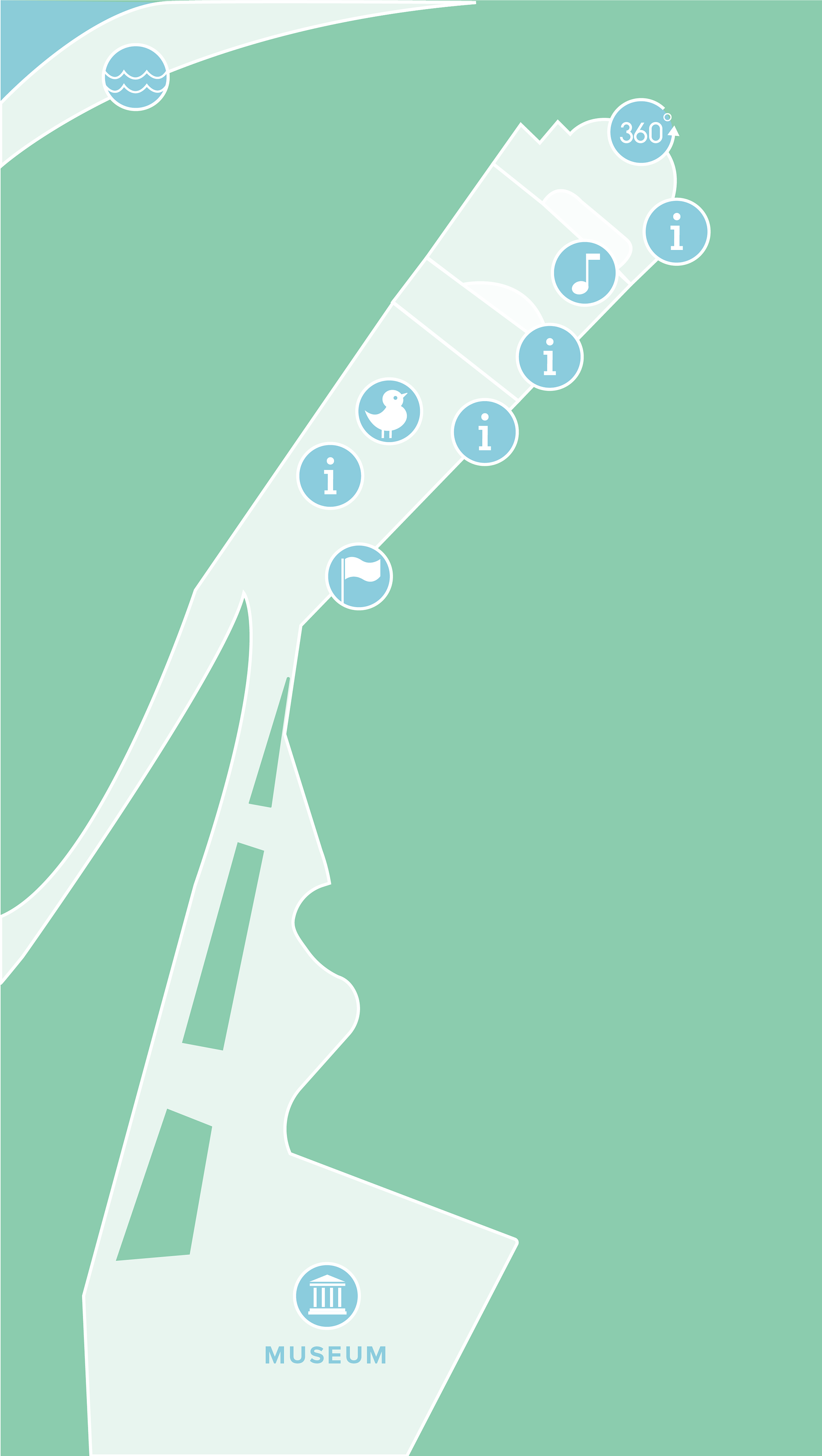
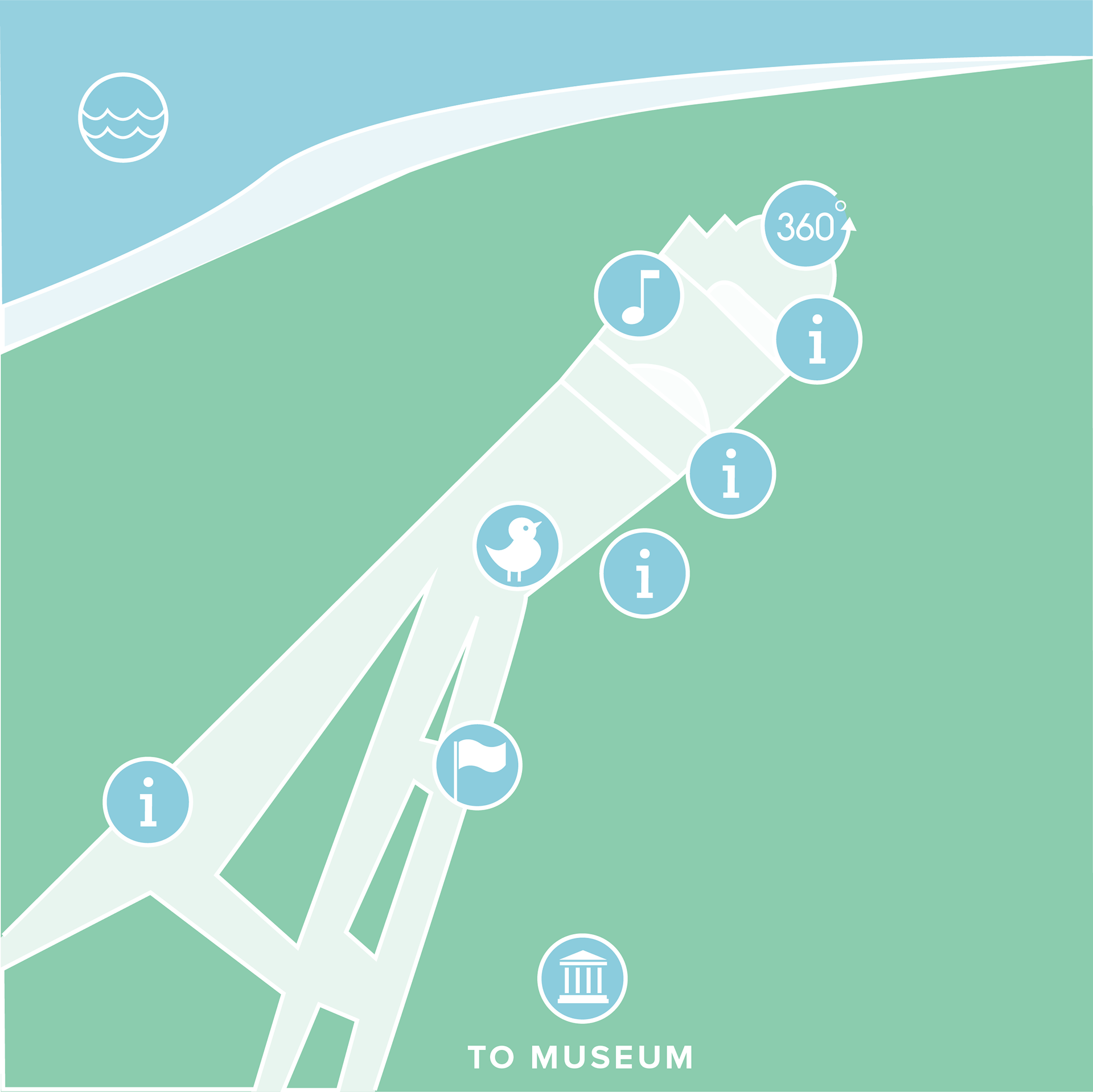
Stanley Park has many points of interest, five of which were planned to be included in the final project release. These locations are accessible via a topographical map, with floating icons that can be activated to teleport to a designated location.
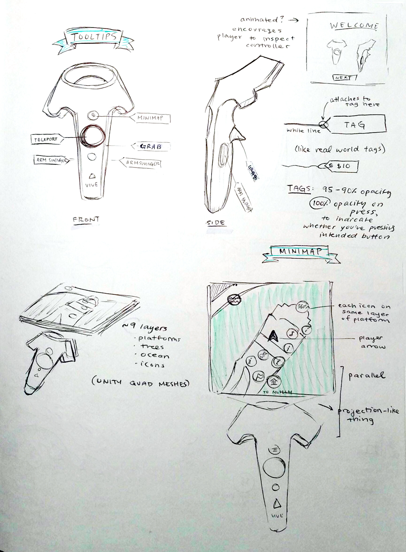
To accommodate for many types of learning, information was portrayed as pictorial, auditory, and textual. Orienting the user are the controller icons, which always remain, and tool tips which activate for the duration of the tutorial.
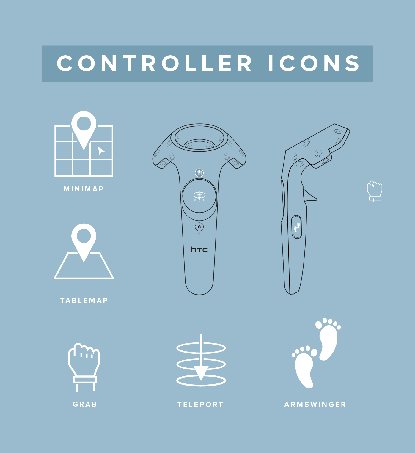
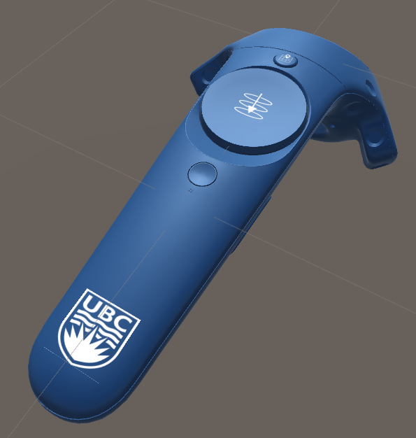
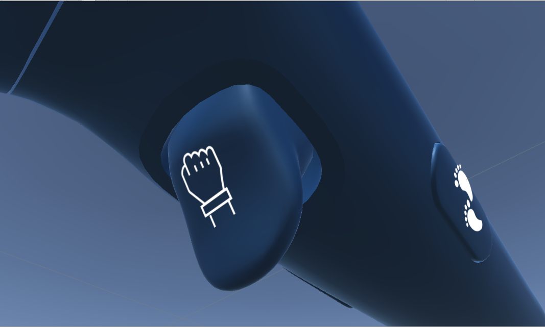
I wanted the experience to feel tailored to the user, and differentiating the HTC Vive controller from others was important to me. Looking to snazz things up a bit, I took the official UBC colour and changed the albedo of the Vive controller model, adding a slight metallic effect. Icons were placed on quads and positioned onto the model, as quads retain better image quality than sprite textures in Unity.
Prospect Point was captured using drone imagery as well as photogrammetry. Details on this process can be found at Metanaut's article here.
Unfortunately, a construction site blocked the majority of the site. Using this as a design opportunity, the space was turned into a museum to showcase the potential expansion of the project to include other areas of Stanley Park.
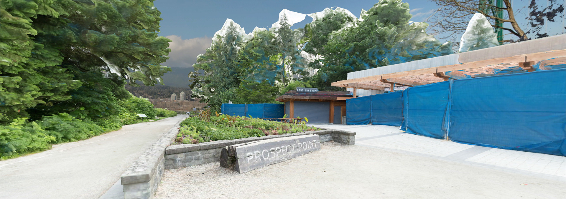
Initial drone imagery complication of Prospect Point with the construction site (right).
Reflection
While I was originally hired as a developer on the team, I transitioned into a design role due to an overwhelming amount of programmers. Working as the sole designer made me realize the need to be very specific in order for my vision to be implemented correctly into the end product.
An example of this is when I entered the game to find that the tooltips were elongated and misshapen, with text aligned differently than I'd imagined and pointing in all different directions. I realized I needed to illustrate my vision in context, not just as an individual element.
The project was a great success for both its audience and shareholders. Through studying real world environmental design principles, I aim to continue inspiring delight and curiosity in humans through VR, MR, AR, and the worlds beyond.